CHARGEASY
Redesigning for a Greener Future: Website redesign for EV charging landing page.
Product Overview
PRODUCT OVERVIEW
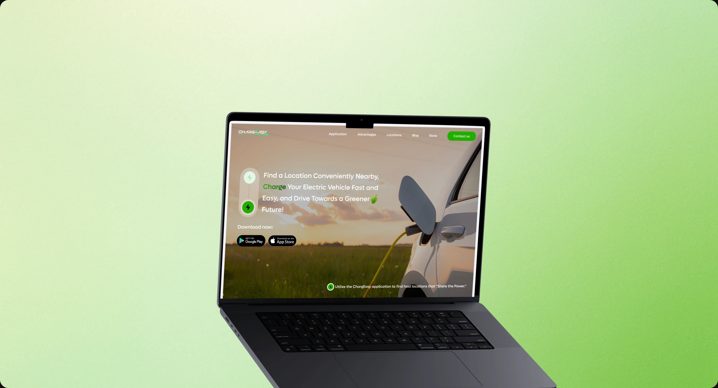
Chargeasy is an EV charging platform that connects electric vehicle drivers with charging station hosts, allowing station owners to monetize their equipment. In March 2025, I led a redesign of the Chargeasy landing page to modernize its look and improve user experience. As new features rolled out, the landing page needed a total redesign to reflect the platform’s evolution. The previous version failed to communicate Chargeasy’s eco-conscious vision, modern features, and value to both EV drivers and potential hosts.
THE CHALLENGE
- 01
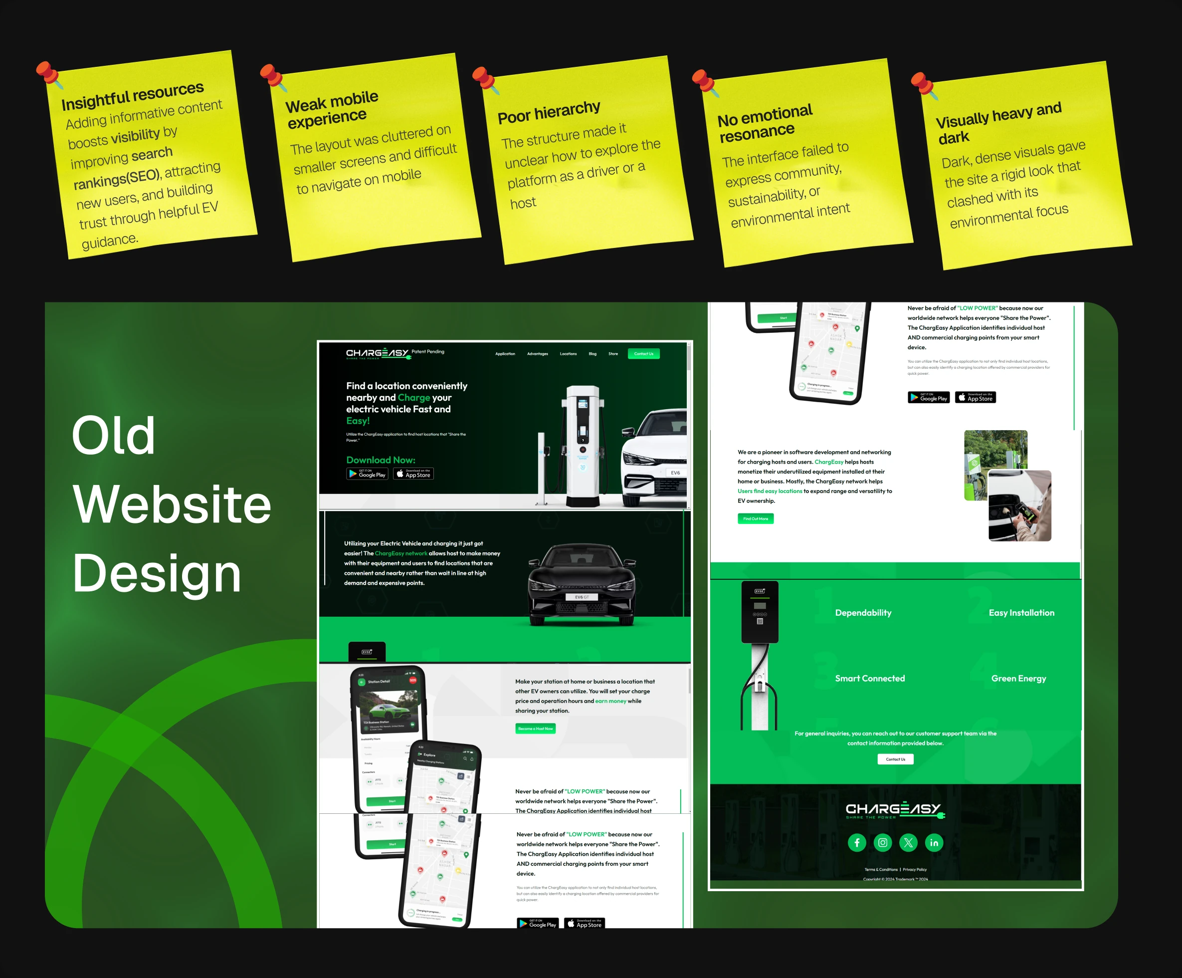
Outdated Brand Positioning
The existing landing page didn't reflect Chargeasy's eco-conscious mission or communicate the platform's environmental impact to users.
- 02
Unclear Value Proposition
The site failed to clearly articulate benefits for both user groups—EV drivers seeking charging stations and hosts looking to share their chargers.
- 03
Poor Feature Visibility
New platform features weren't properly showcased, leaving users unaware of recent improvements and capabilities that set Chargeasy apart.
Issues with the Old Design
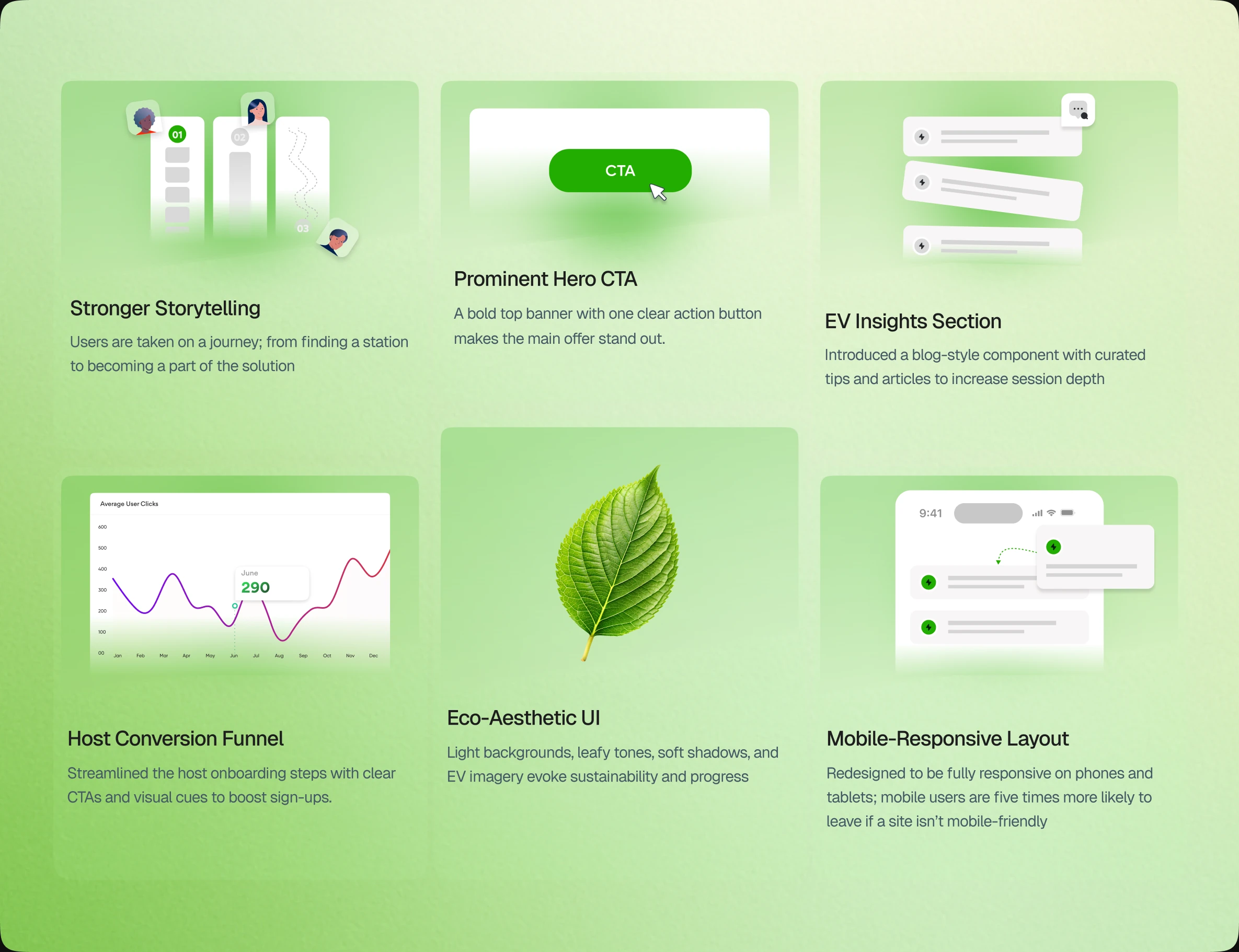
Improvements in the New Design
Variations
VARIATIONS
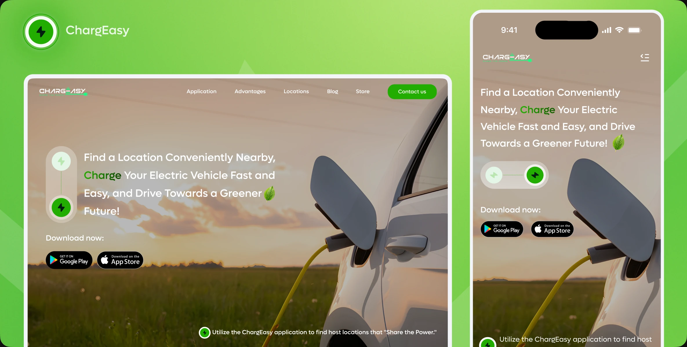
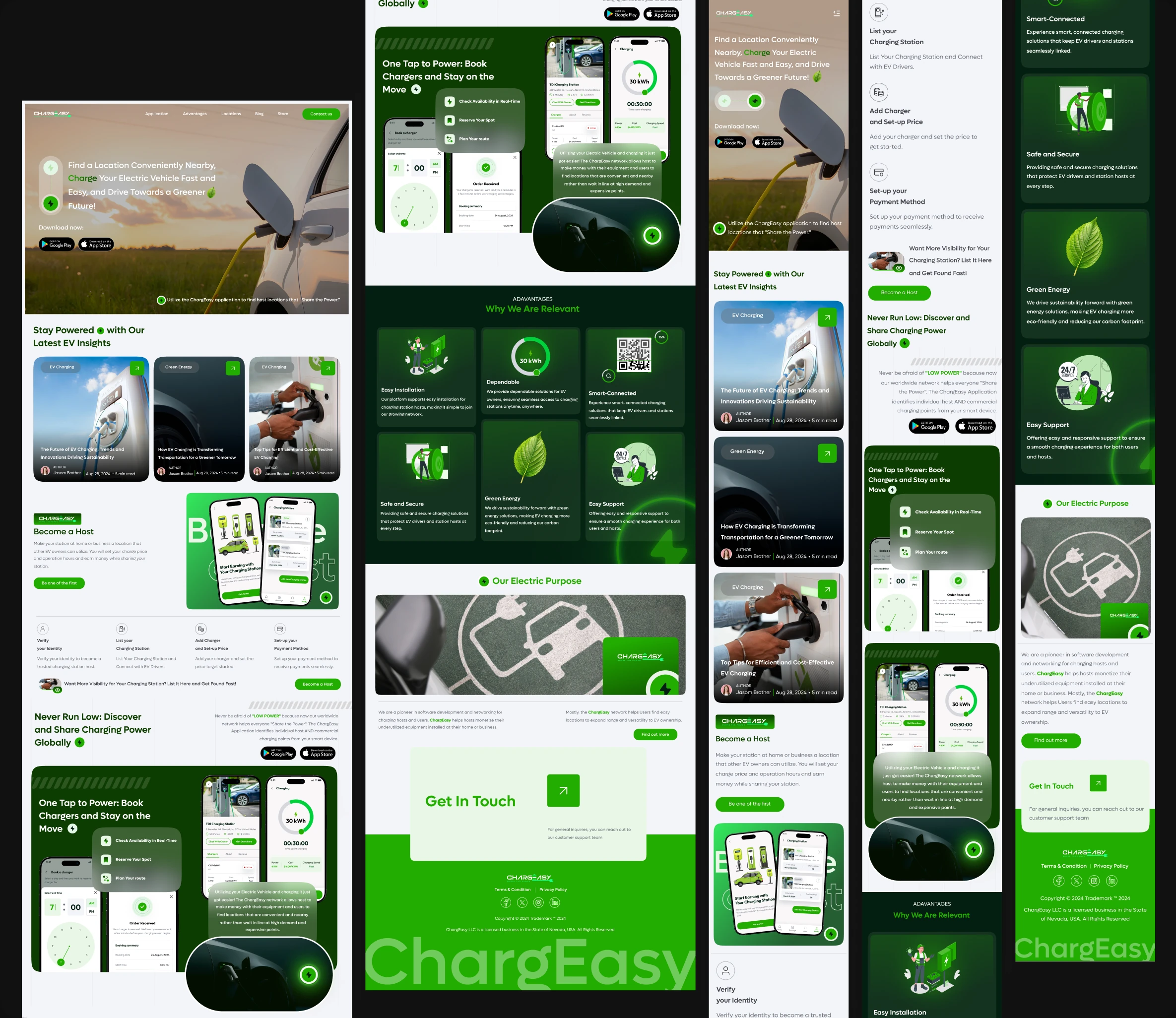
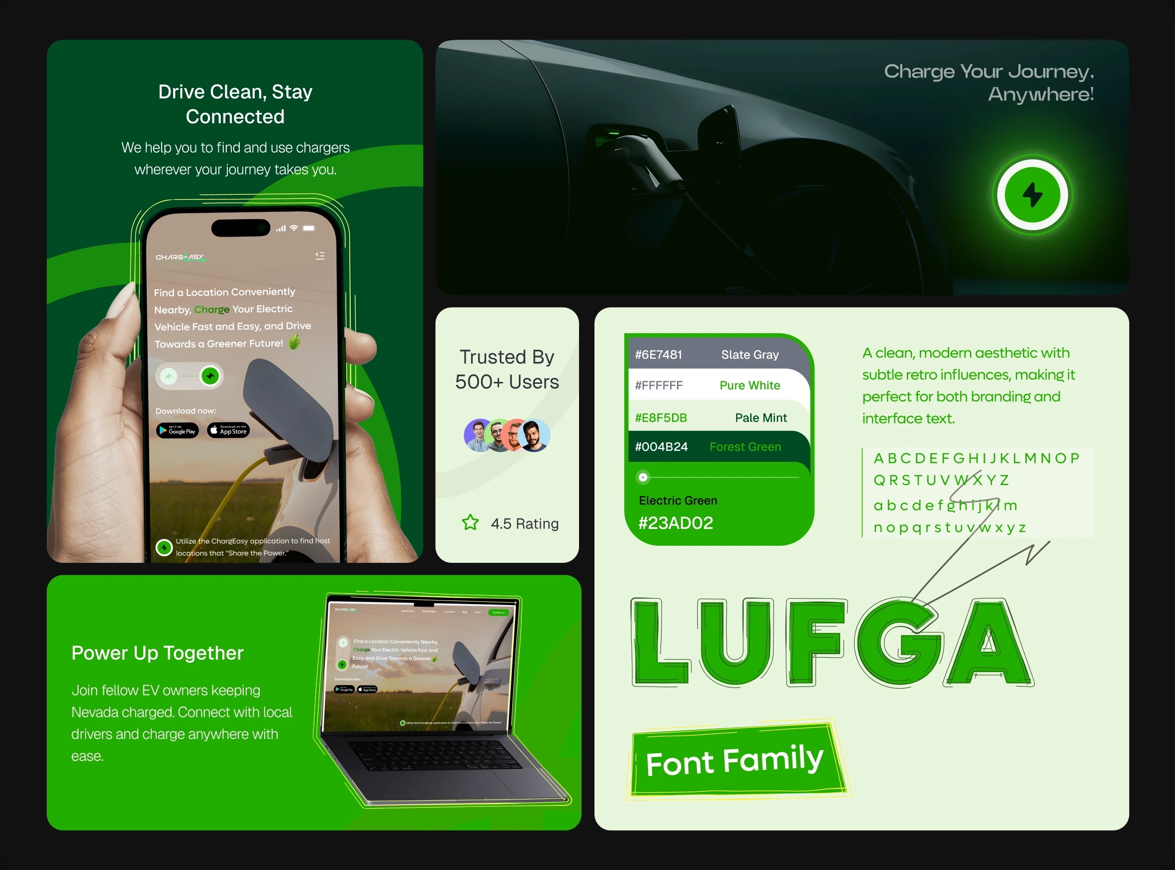
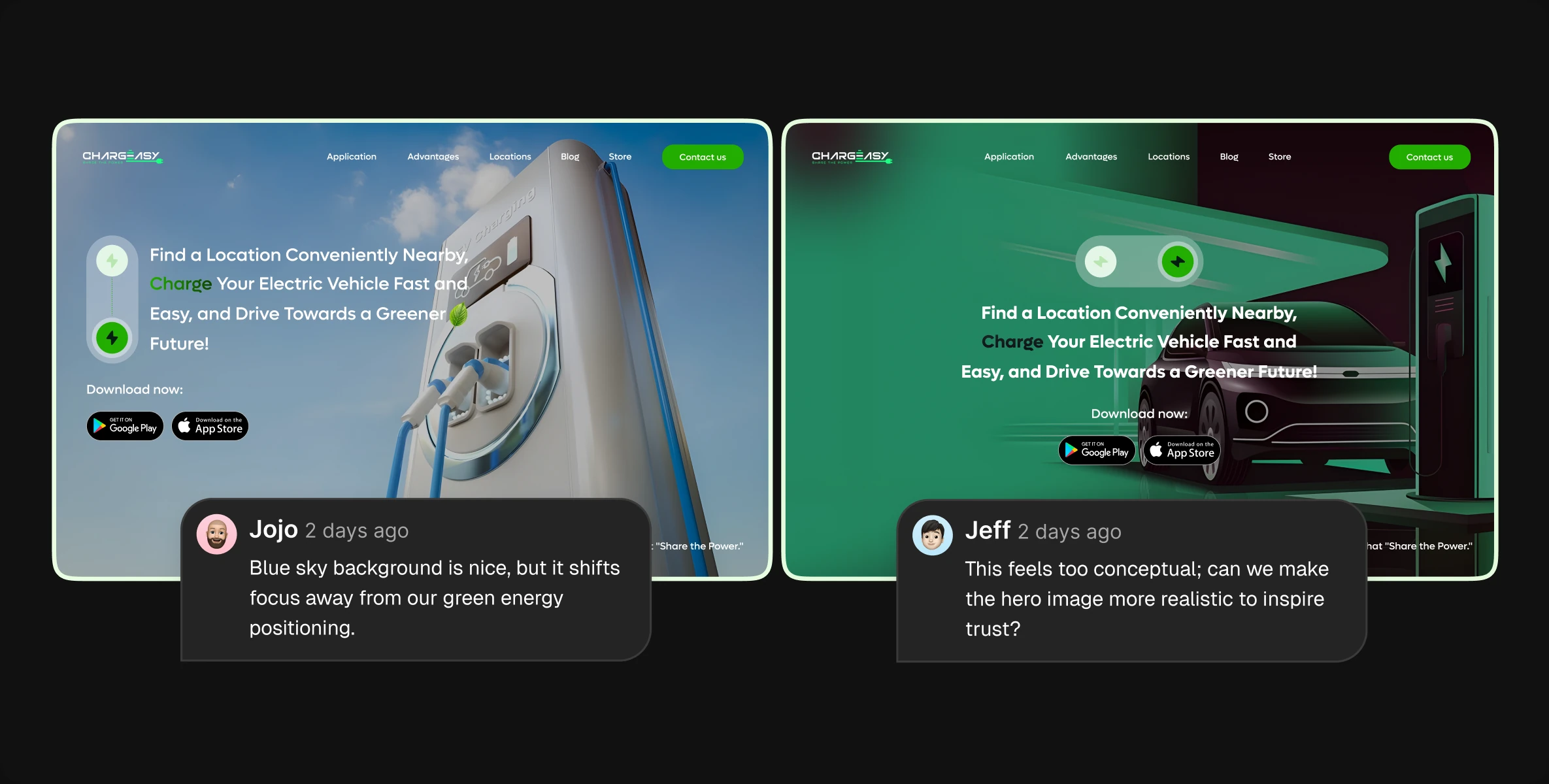
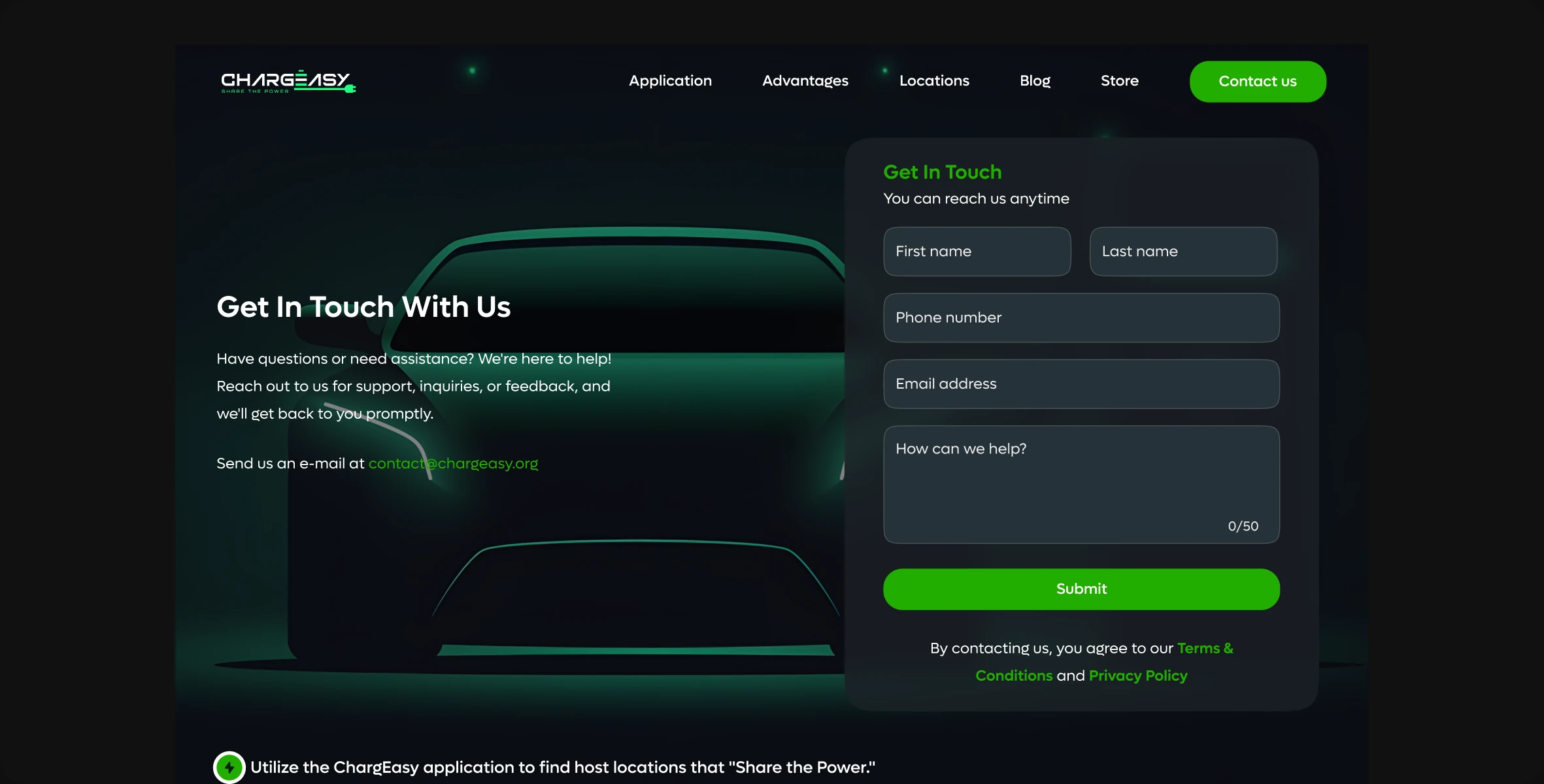
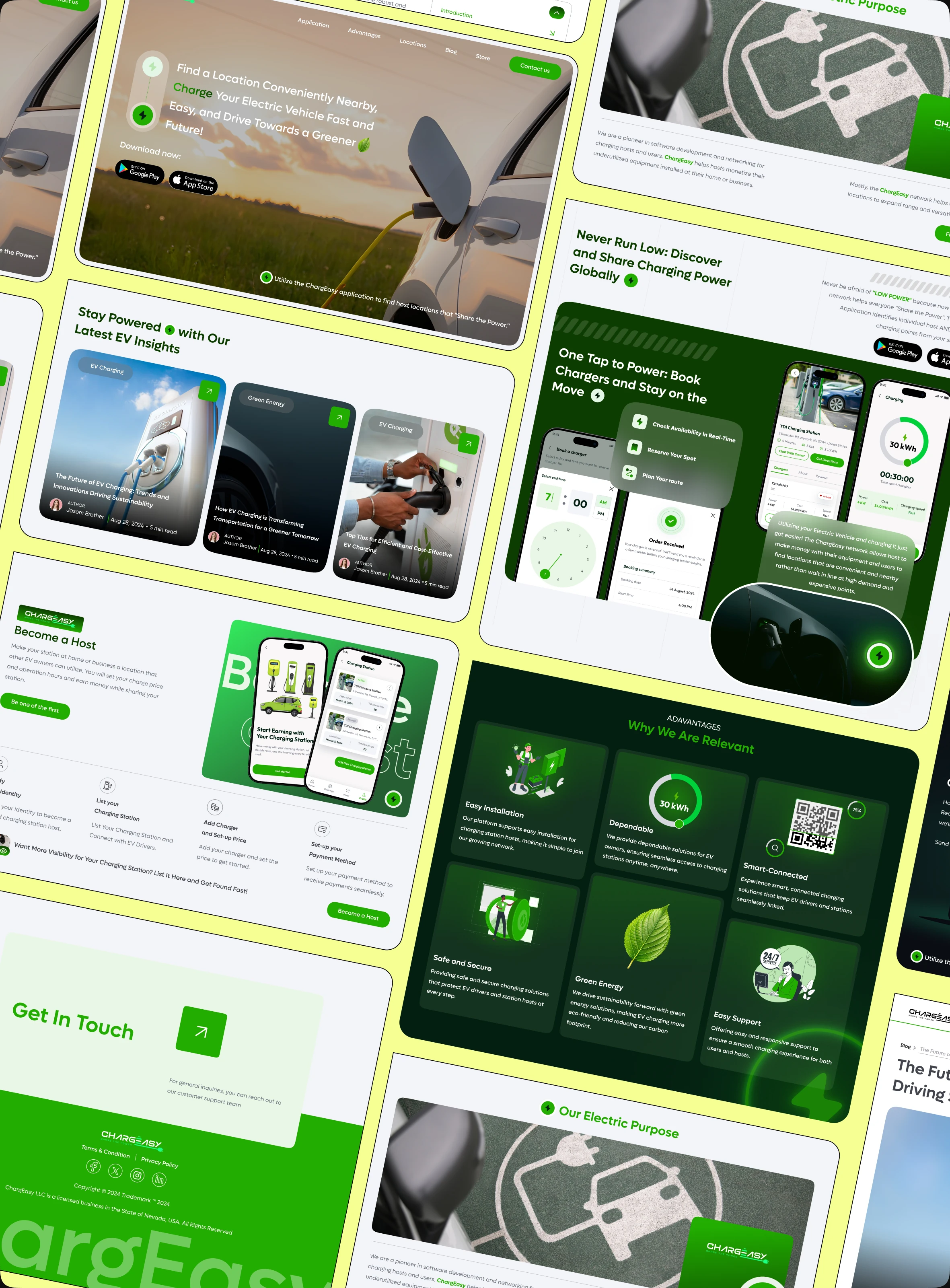
Tried different variations and presented to the clients to get their feedback. Client feedback indicated the first concepts felt too rigid and abstract. The redesign used lighter colors, realistic charging scenes, and imagery that reflected Chargeasy’s Nevada roots, creating a friendlier and more environmentally aligned feel.
Final Designs
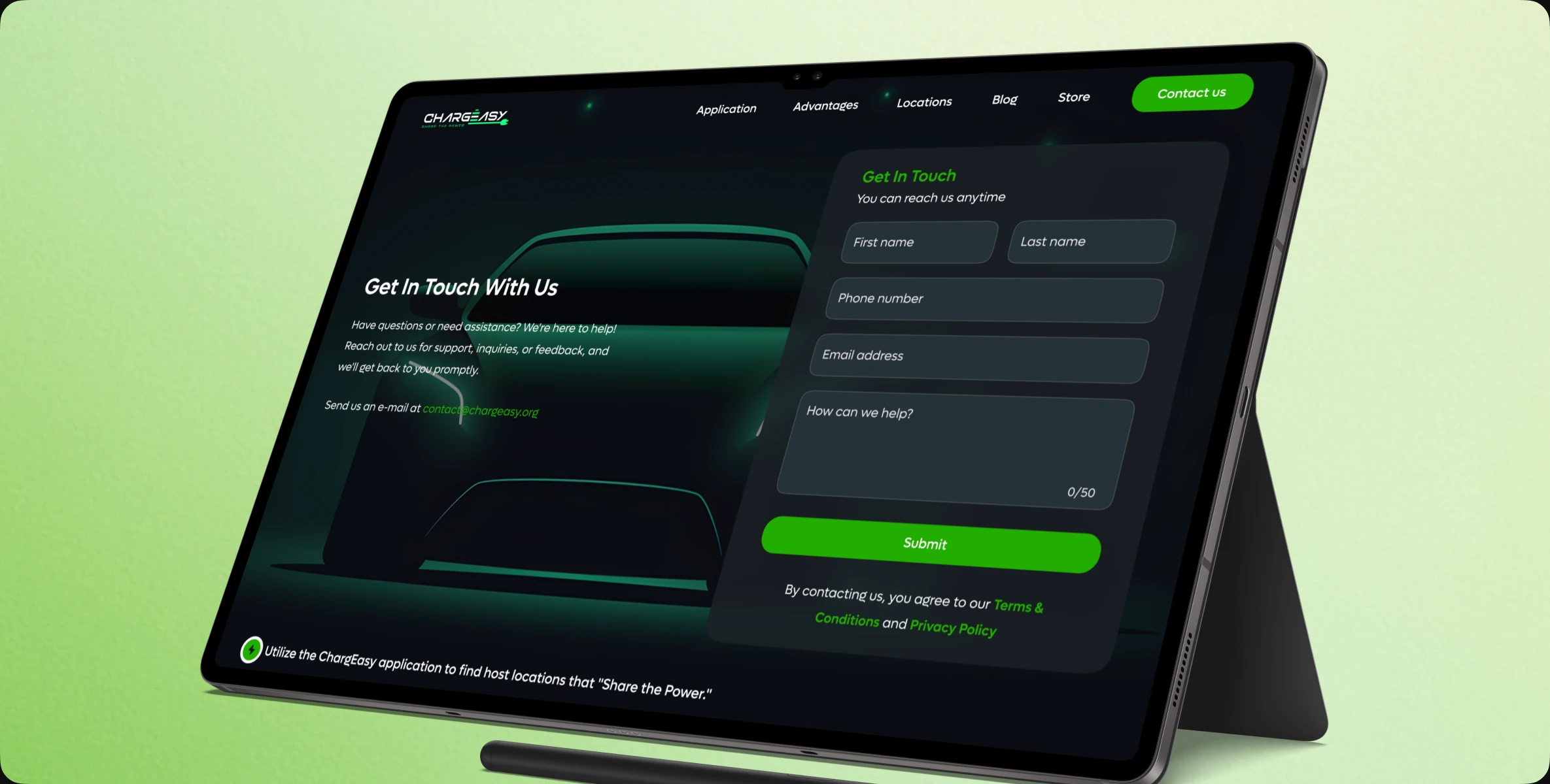
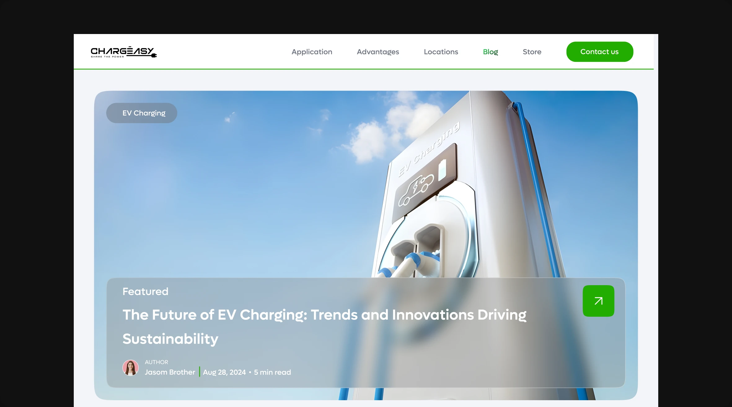
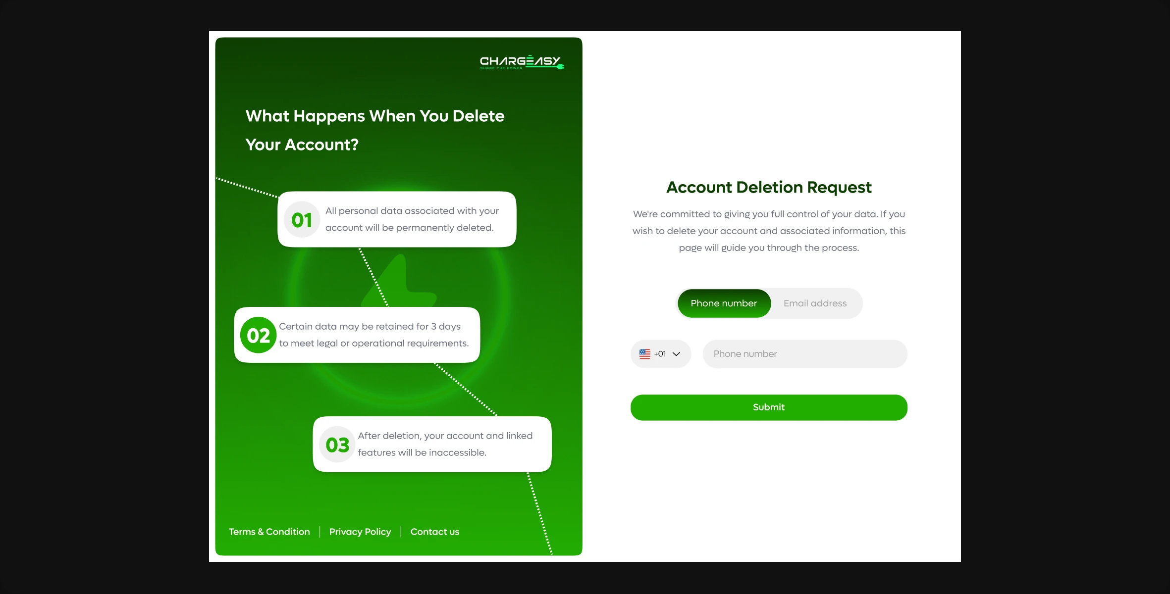
Impact & Reflections
IMPACT & REFLECTIONS
The redesign shifted Chargeasy from looking like a generic utility tool to feeling like a community-driven green mobility platform. Visual cues for sustainability and simpler user paths improved clarity and trust while aligning the interface with the company’s mission.