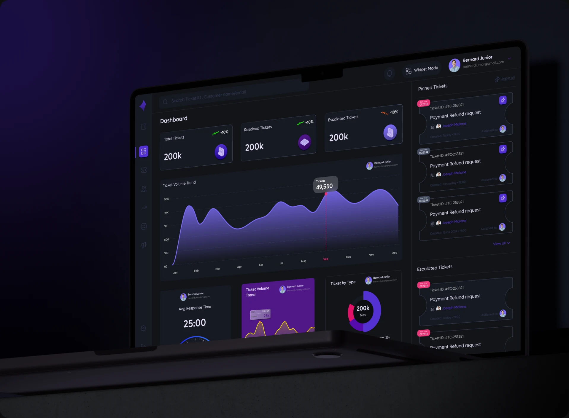
MY PORTFOLIO
Designing and building my own portfolio, from the first frame in Figma to the live site you are reading now.
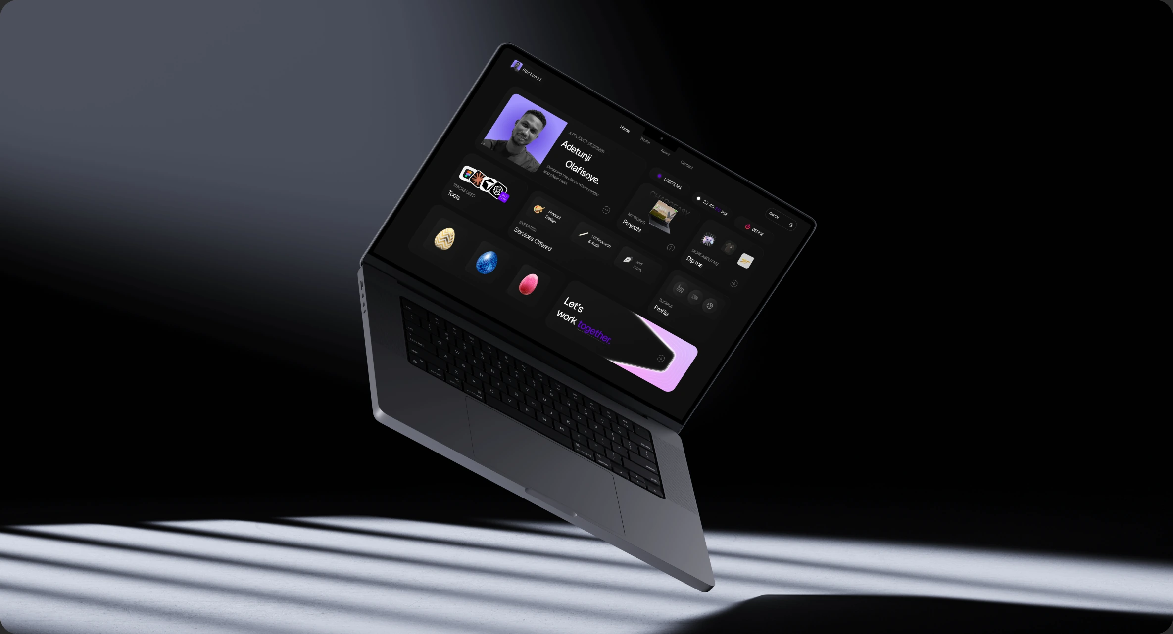
Product Overview
PRODUCT OVERVIEW
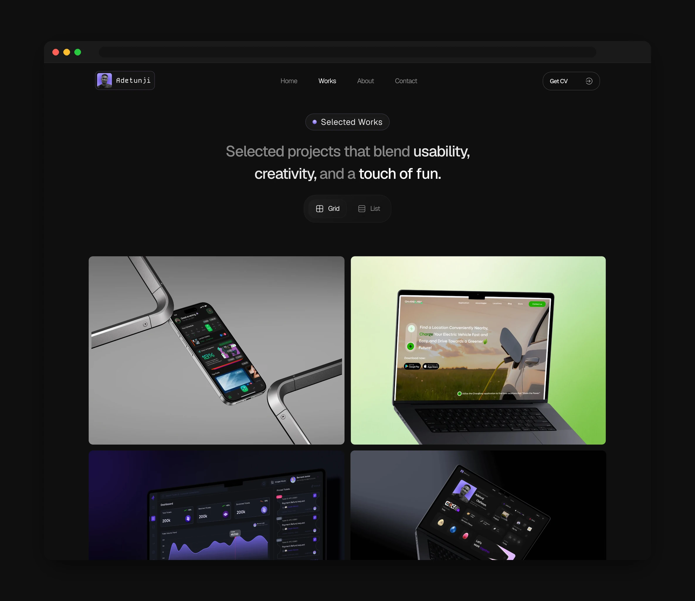
This portfolio is a project I designed and built on my own, start to finish. I did not want a folder of screenshots. I wanted a small product that shows how I think and feels good to use. I designed it in Figma and built the whole thing with Claude, working from the design straight into the code. Every page is made of small cards, so you can read who I am and what I make at a glance. It is the site you are looking at right now.
WHAT I WANTED
- 01
Show how I think, not just what I made
I wanted the site itself to read like a piece of my work. Clear structure, an honest look at the process, and a point of view you can feel on every page.
- 02
Feel alive, but stay out of the way
The motion is there to give the site some personality, like the intro loader and the small hidden game. It should never slow you down, and it turns itself off for anyone who prefers less movement.
- 03
Be easy to keep up to date
Adding a new project or a new case study should not mean rebuilding a page. I keep all the words and images in plain content files, so the site grows by editing text.
Early Conception in Figma
DESIGN & CONCEPT
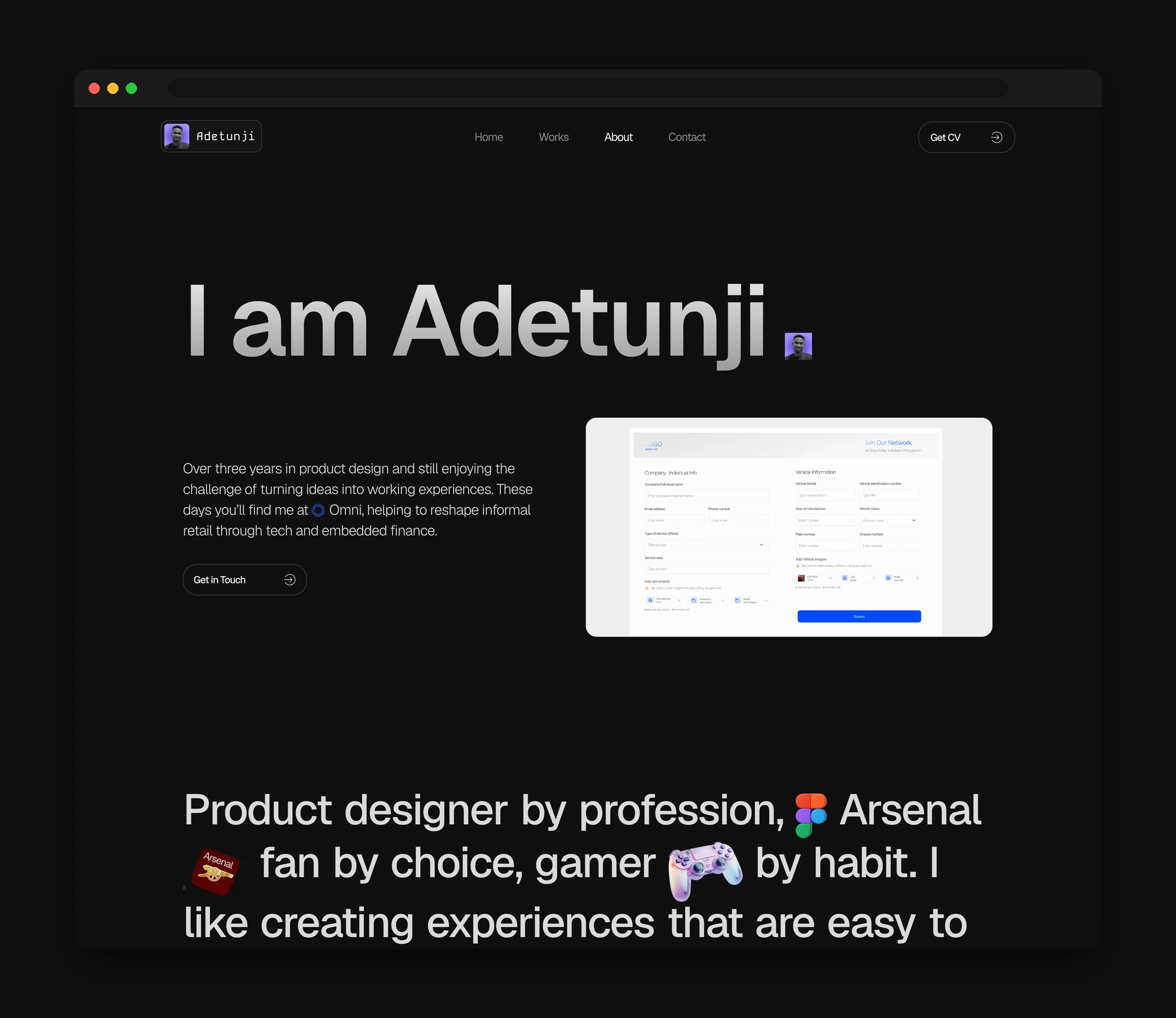
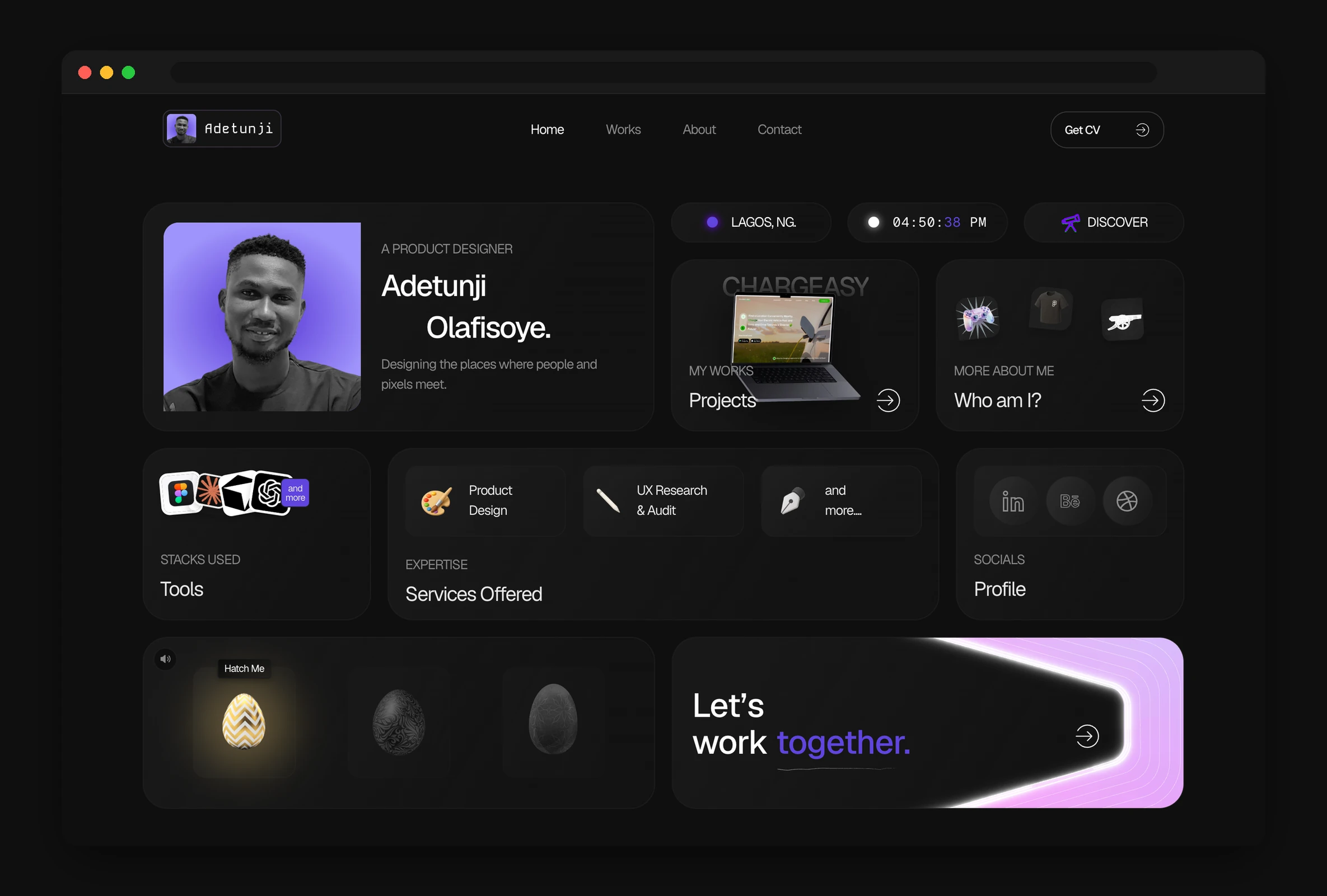
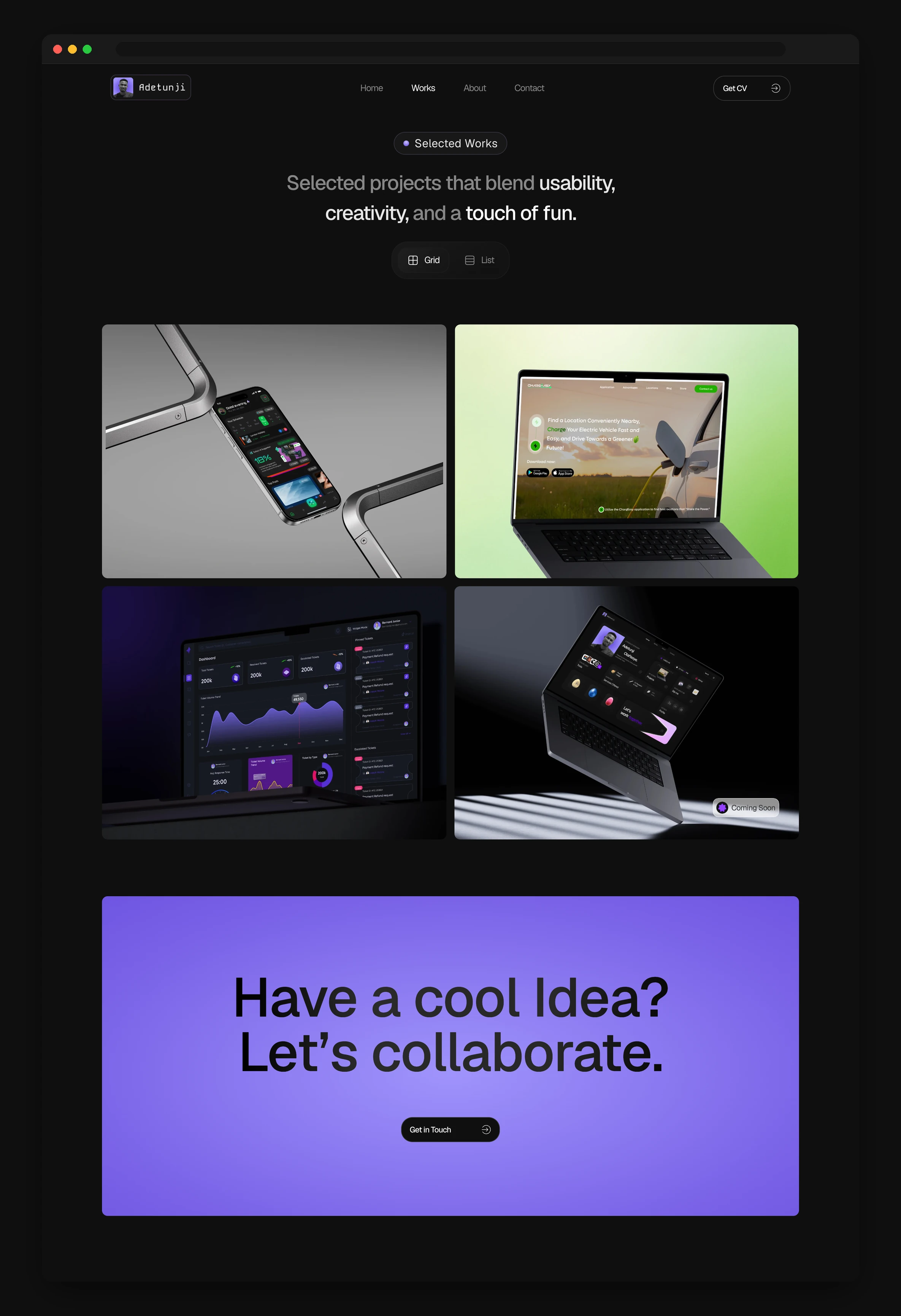
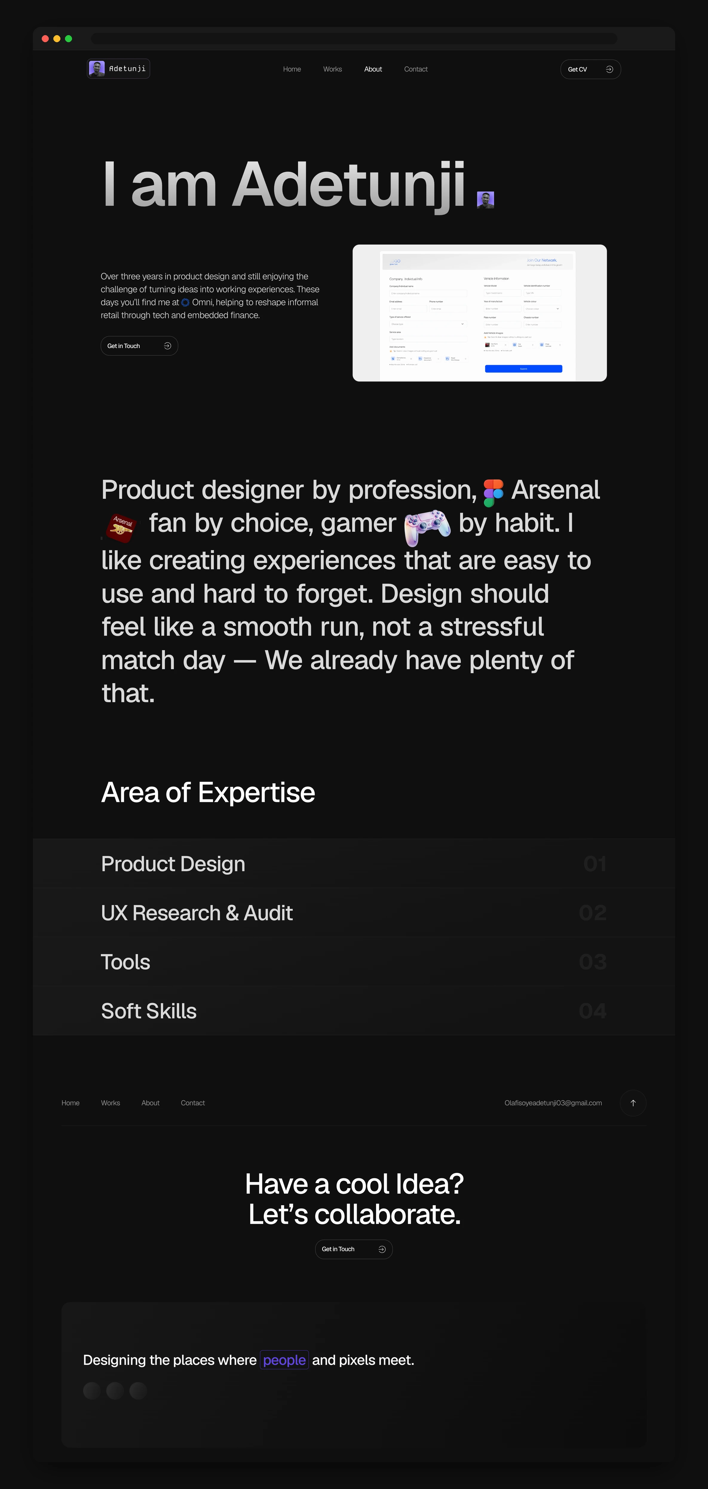
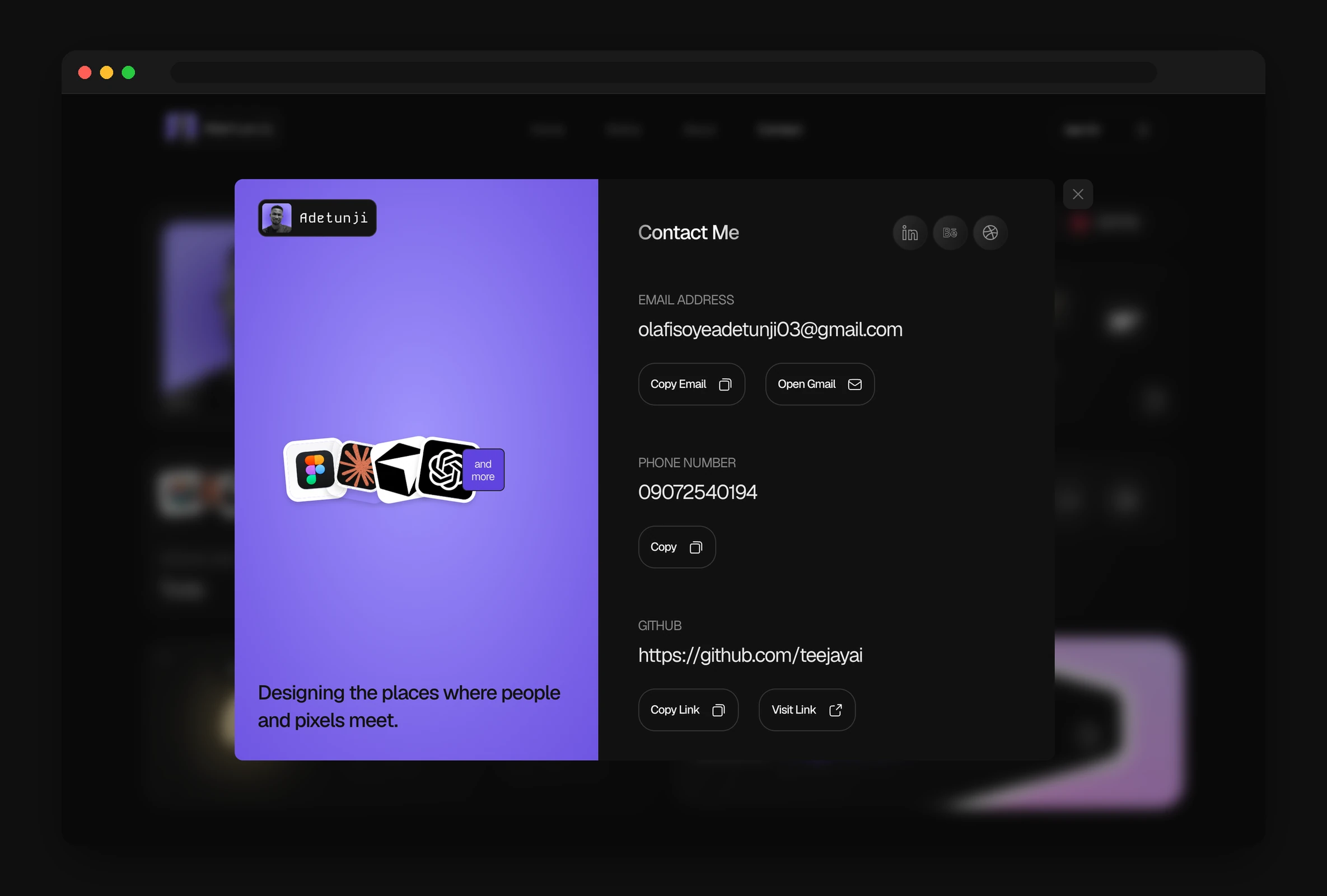
It started in Figma. I began with rough wireframes to work out the card layout. How many cards there should be, what each one needed to say, and how they should stack on a phone versus a laptop. Once the structure felt right, I built a small set of design choices to hold everything together. A near black background, one purple I use only for buttons and links, Geist for all the text with Kode Mono kept just for the logo, and soft card surfaces. I saved these as Figma variables and turned the repeating pieces into components, so the colours, spacing, and type sizes all lived in one place. That paid off when it came time to build, because Claude could read the variables straight from the file and pull the components and images out as it went, instead of me handing over every value by hand. I then drew the home, works, about, and contact screens in full detail and prototyped the moments that needed to move, like the intro loader and the contact panel, before any code was written.
HOW I WORKED
- 01
Gather and decide
I collected references, wrote down the story each page had to tell, and settled on the tone before I opened Figma.
- 02
Wireframe and prototype
Rough card layouts first, then detailed screens and clickable prototypes for the loader and the contact panel.
- 03
Turn the design into a system
I saved the colours, type, and spacing as Figma variables and turned repeating pieces into components, so the tokens and assets sat in one place and the code and design never drift apart.
- 04
Build, then ship
I built the pages in React with Claude, checked them for speed and for people who prefer less motion, then pushed to GitHub and let Vercel take it live.
How I Built It
TECH STACK
I built the site with Claude, using Next.js and TypeScript, and styled it with Tailwind that reads from the same variables I set up in Figma, so the design and the code stay in step. Framer Motion handles the entrance and scroll animations. There is no database and no content system behind it. Every page is turned into plain HTML at build time, which keeps it fast and simple to host. Images are served in modern formats through Next.js so they stay light without looking soft.
Responsive Design
RESPONSIVE
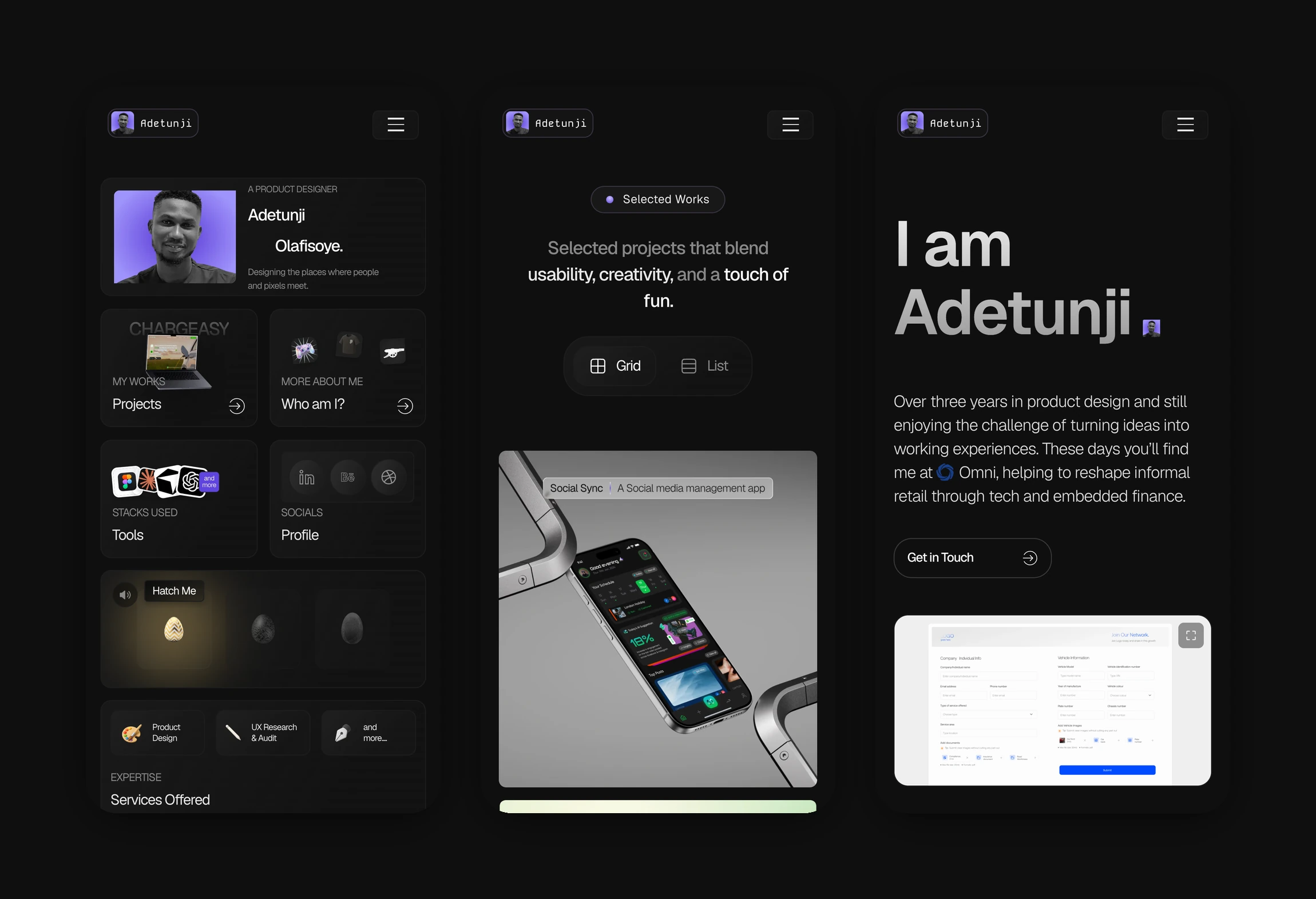
The layout is built to fit whatever screen you are on. On a phone the cards stack into a single column you can thumb through in one hand. On a laptop they open out into the full grid. A few of the heavier moving parts, like the zoom on the about page, only run on bigger screens where there is room for them, so the phone version stays quick to load and easy to read.
Shipping It Live
BUILD & DEPLOY
The code lives in a GitHub repository, which is my single source of truth and my record of every change I have made. Vercel is connected to that repository, so each time I push an update it builds the site and puts the new version online in about a minute. The site runs on my own domain, which I point at Vercel, and I manage that domain and its DNS records on Cloudflare. In practice this means I can go from an edit on my machine to a live change on the site in one push, with nothing to set up by hand each time.
Final Designs
Looking Back
REFLECTIONS
Designing and building the same thing myself meant there was no gap between what I drew and what shipped. Every spacing and every bit of motion is what I intended. Keeping the content in plain files paid off too. This very case study went in without me touching the layout, which was the whole idea. A site that keeps up with the work instead of falling behind it.